Intro Drawings
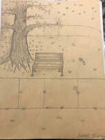
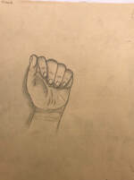
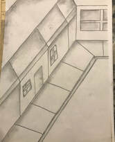
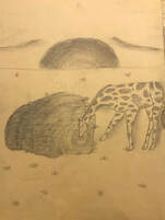
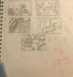
As an assignment, I drew a tree in a landscape, an animal, a street scene, and my hand. My main focus on all four drawings was the shading of the different areas. I added many details and noticed that the most difficult task to accomplish was the POV.
|
|
|
|
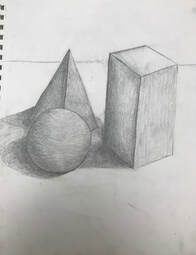
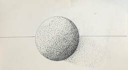
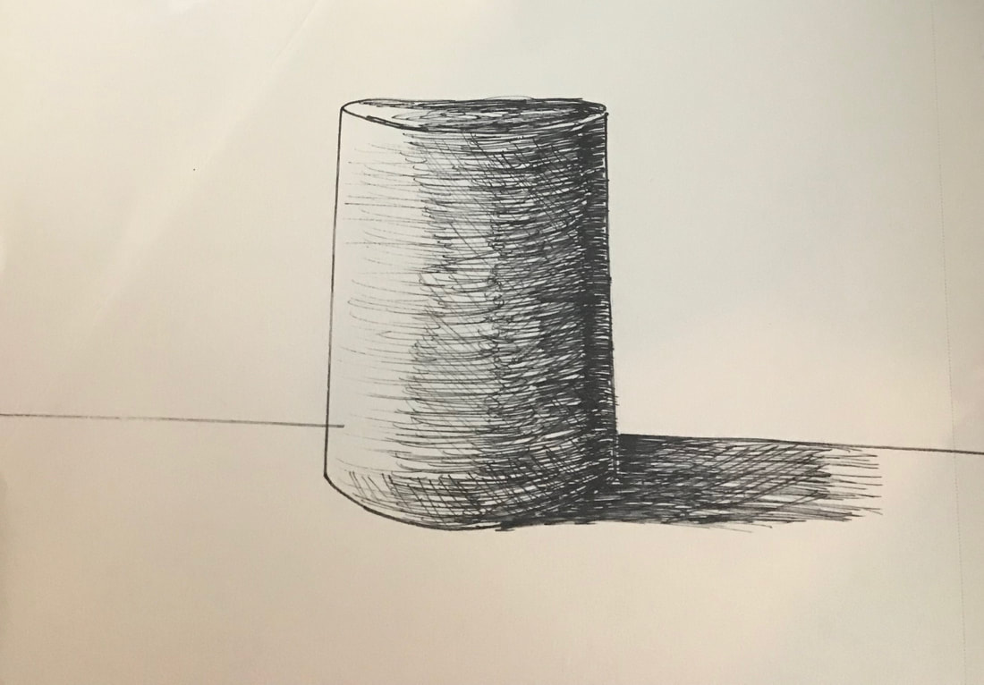
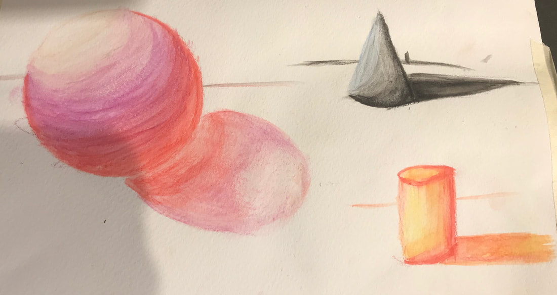
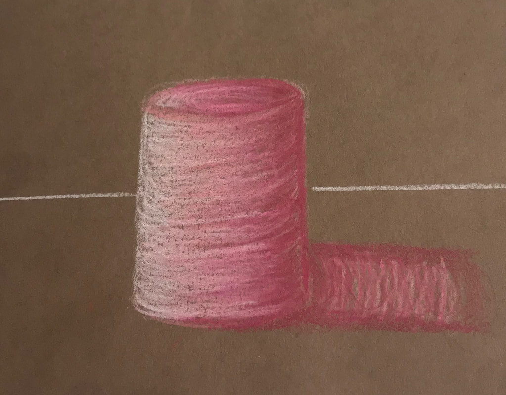
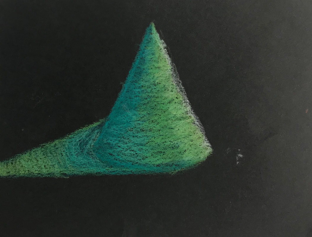
4 Shapes
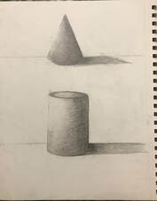
I was given the assignment to draw a sphere, cylinder, cone, and cube. I added shading and a background so that the shapes did not look like they were floating. I really enjoyed creating the cylinder and find that it is my favorite shape out of the four.
|
|
Pencil Shape Groupings
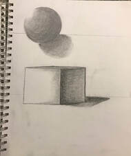
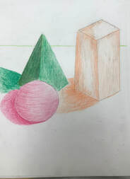
This assignment required two drawings of three shapes. The shapes that were given to me are provided below, a sphere, prism, and an orthotope. I was required to draw two drawings, one in colored pencil and another in regular pencil. I enjoyed the color pencil drawings because it required color and different blending techniques.
|
|
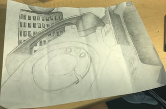
Still Life Pencil Drawing
Self Evaluation:
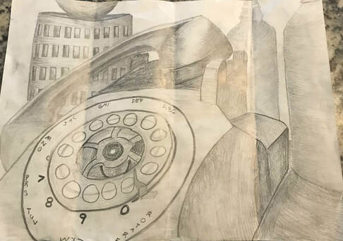
1) My composition consists of a telephone, basket, two glass bottles, and a ball. I think that this was a successful composition because I defined the different objects in the piece and outlined each object.
2) Yes, I used different values depending on what areas were lighter or darker. I added dark shadings near the edges of objects to show that the object was facing the view.
3) As I practiced, I got to really feel how to control the pencil and that helped me create the piece.
4) I used a curved technique for the round objects to show on paper that they are round. I also added shading to show the different dark areas needed to define an object.
5) When applied it can give dimension to the objects and will give the objects more visual representation.
6) If I could recreate my pieces I would have added more definition to the glass bottles.
In progress pictures
|
|
|
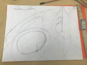
Compositional sketches
Finished Still Life Pencil Drawing

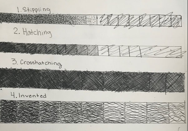
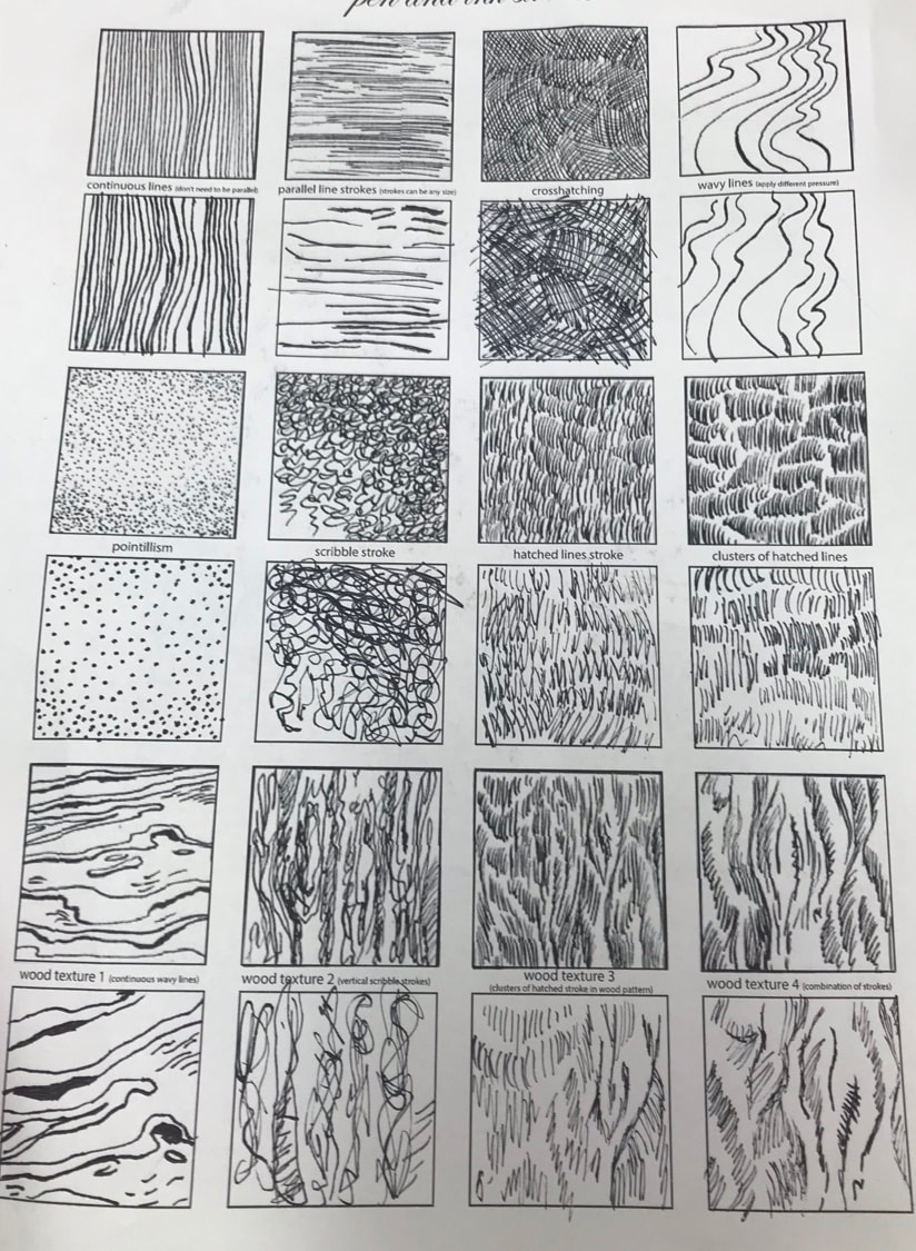
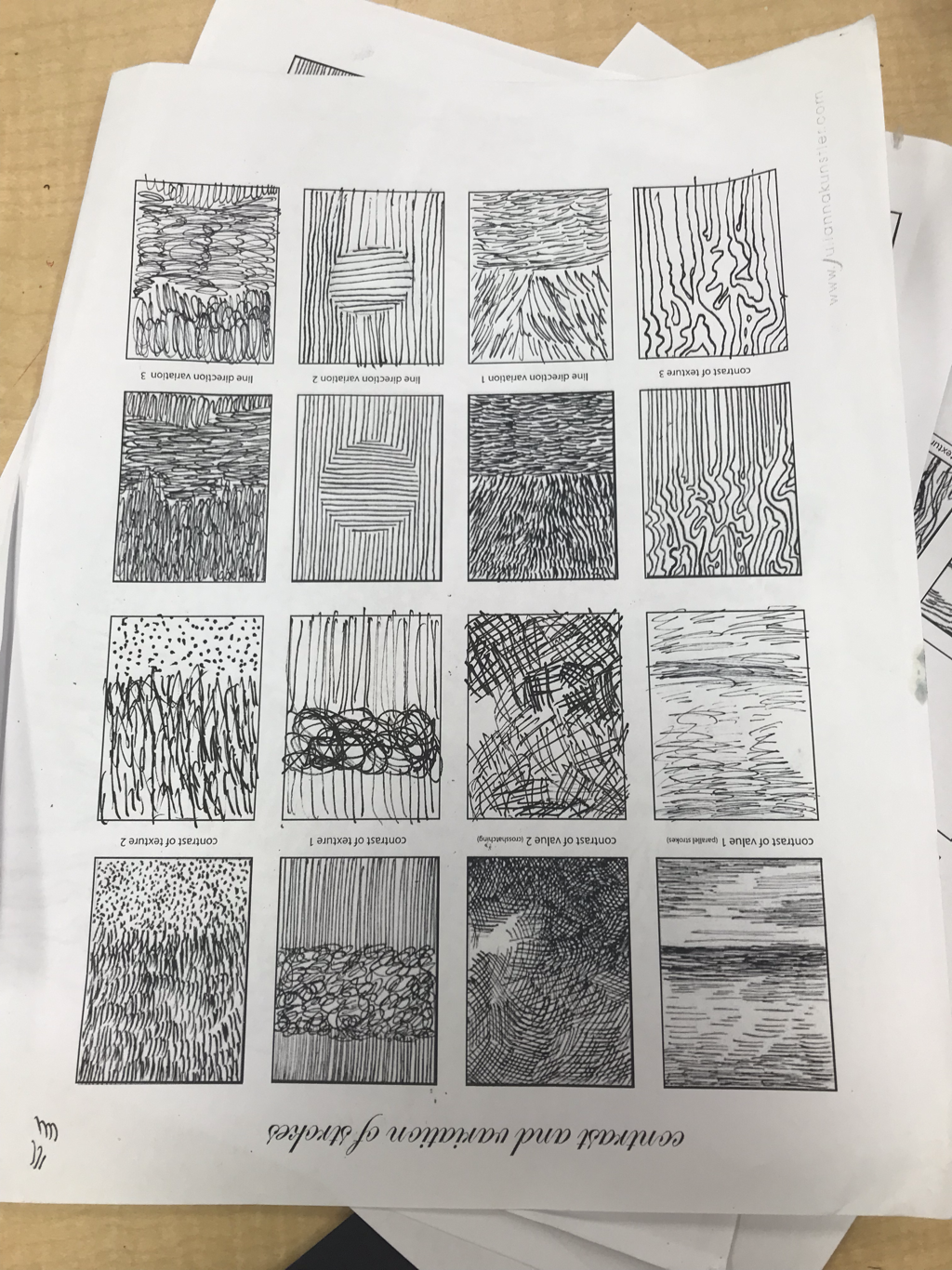
Pen and Ink Intro to Unit
I was assigned to practice pen techniques and draw two shapes using some of the techniques and or patterns I learned.
|
|
|
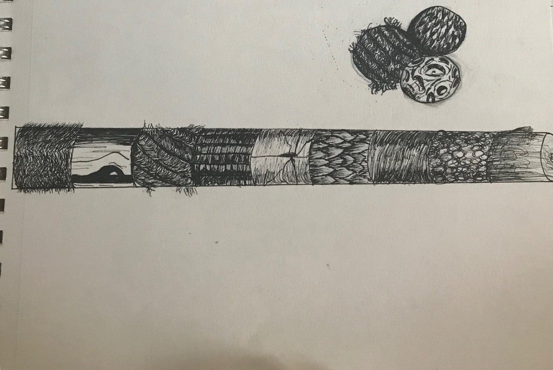
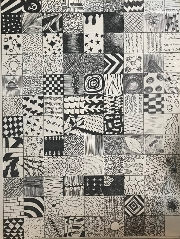
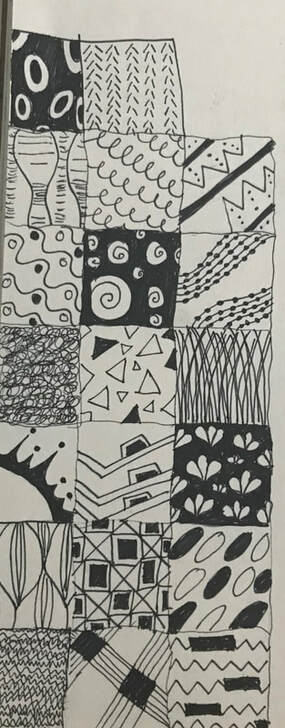
100 Pen Patterns
I was assigned to draw 100 inch boxes and create my own patterns to use for my final pen drawing.
|
|
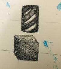
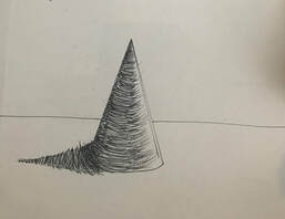
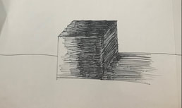
4 Shapes in Pen
I was assigned to draw four shapes and use shading and pen techniques to help me create the shapes and make them look 3-D.
|
|
|
|
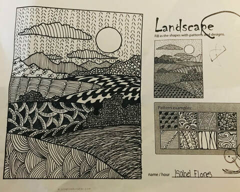
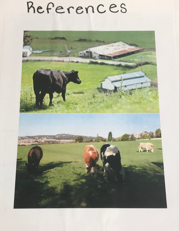
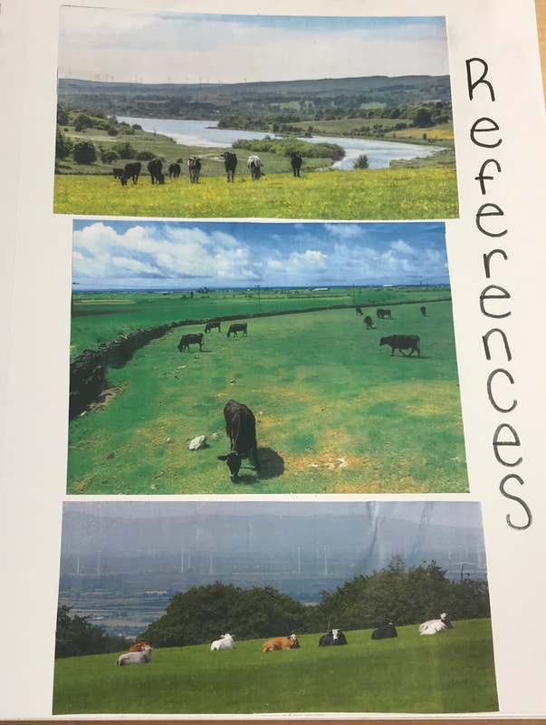
Landscape pattern practice

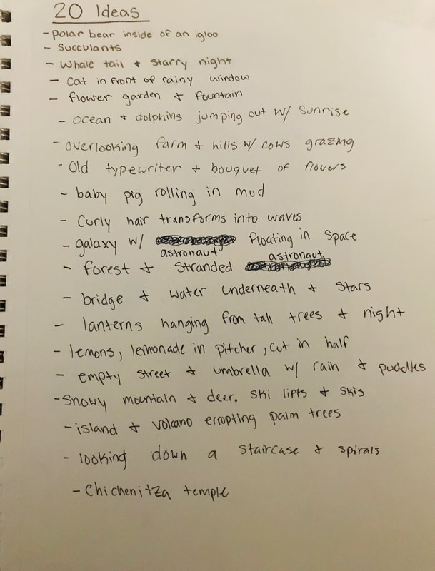
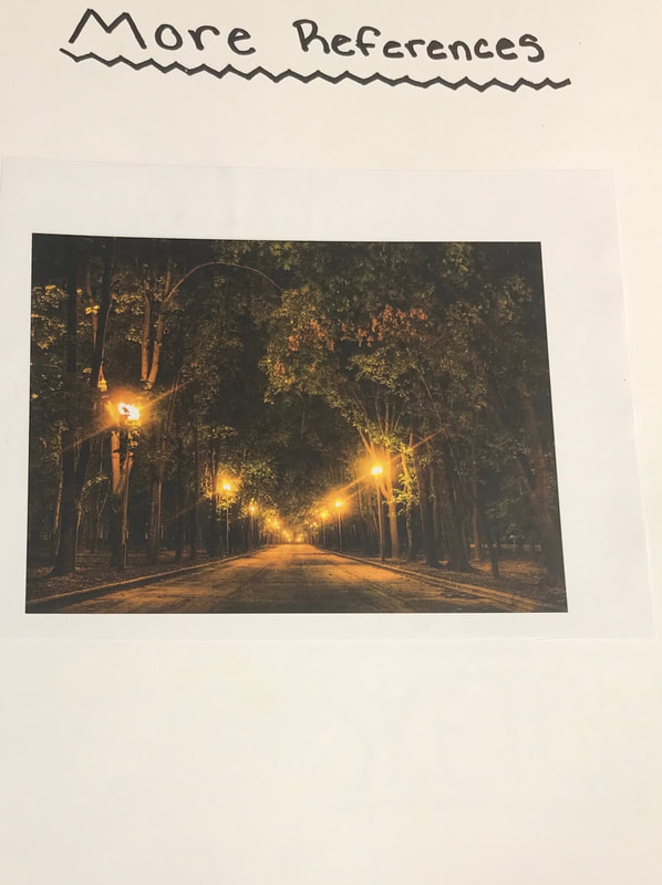
20 Final Pen Art Ideas
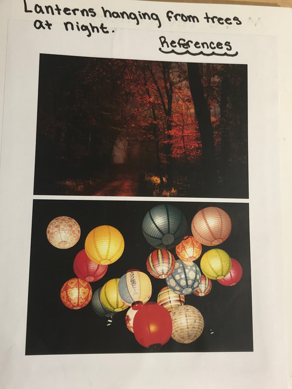
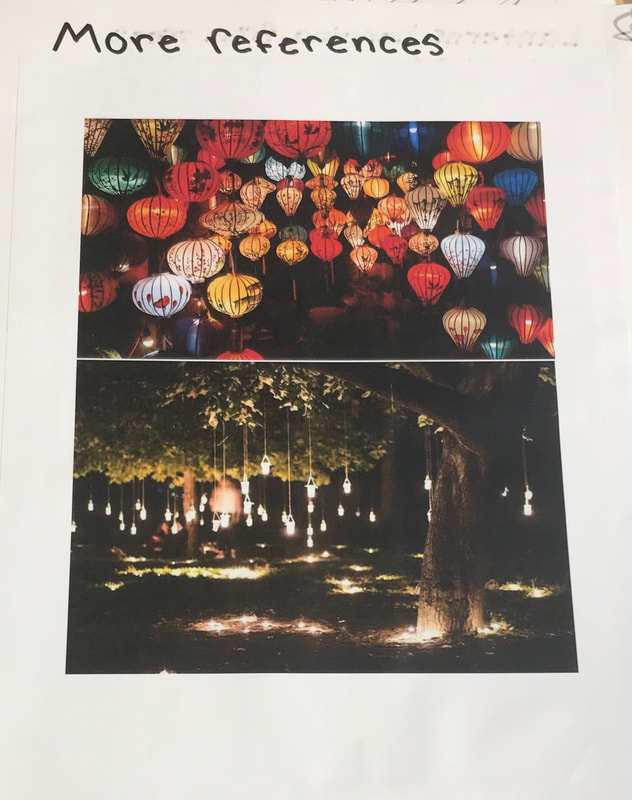
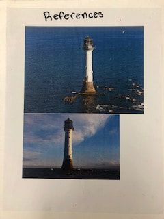
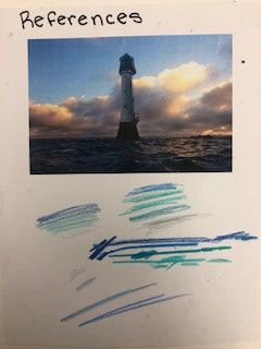
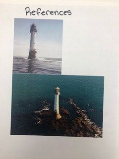
Reference Photos For Final Pen Drawing
|
|
|
|
|
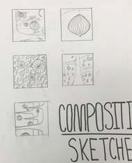
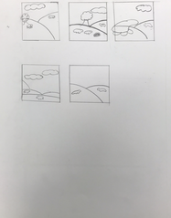
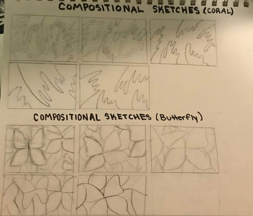
Compositional Sketches
I was assigned to choose two ideas and create five different drawings based off of one idea for each.
|
|
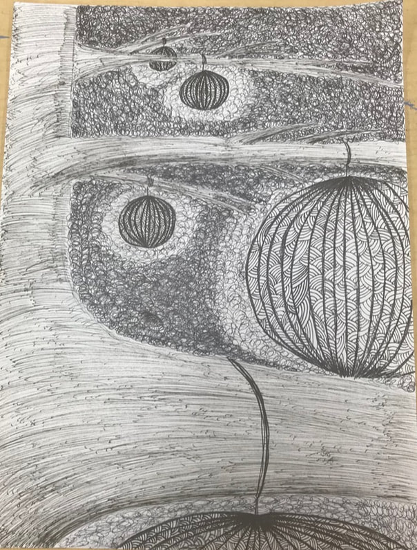
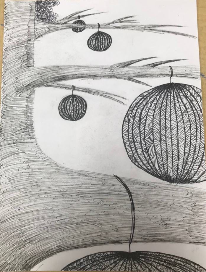
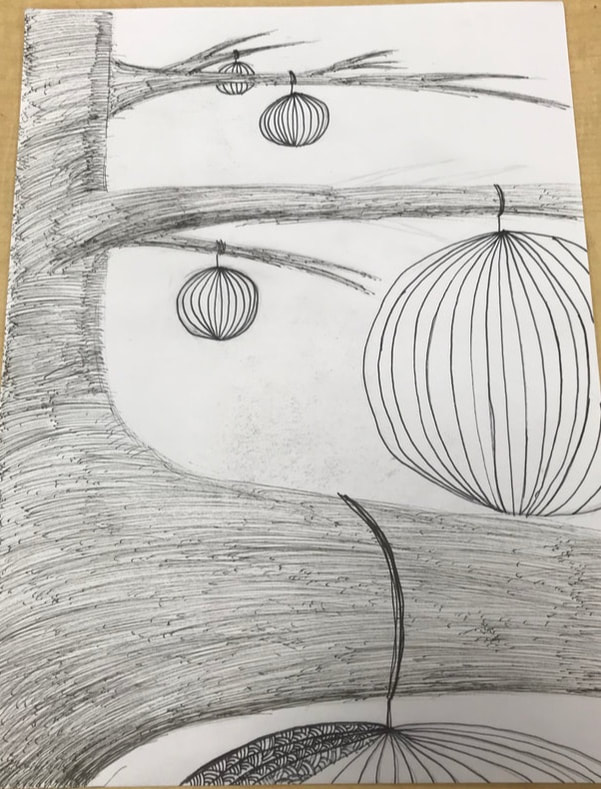
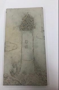
Final Pen drawing in progress sketches
|
|
|
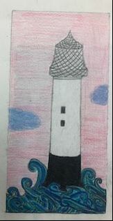
Final Pen Drawing
1) I think that this is is a successful composition because.
2) Texture and patterns are important in a good composition because certain patterns may camouflage with the surrounding areas.
3) Value is important in this project because value creates shading and realistic images.
4) I think my technique is good because I used patterns that would not overlap.
5)

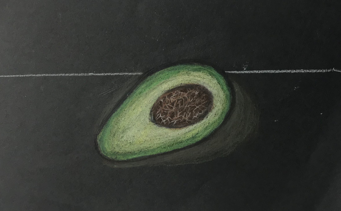
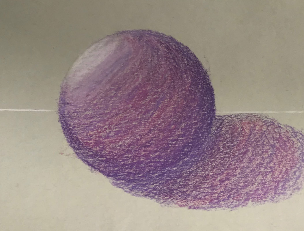
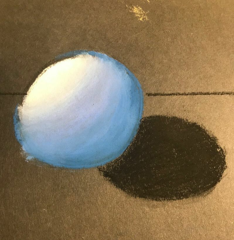
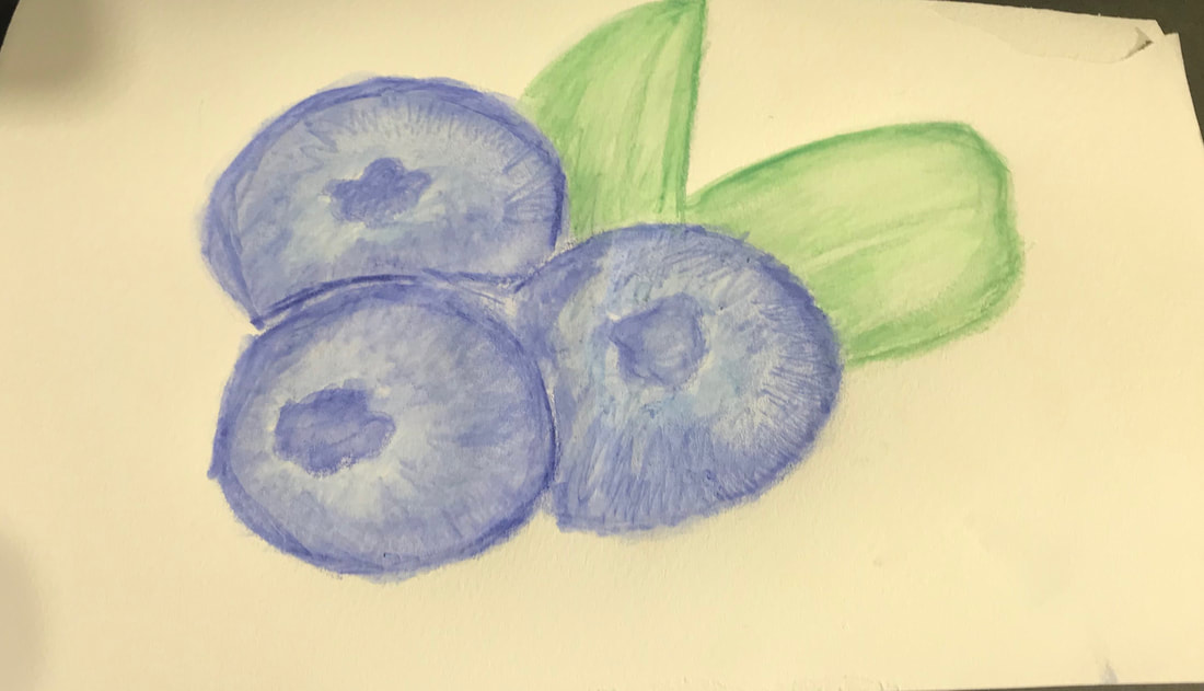
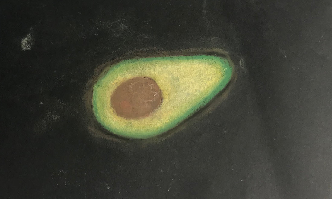
Practice Pastel, Prisma, and Watercolor
In class I was assigned to practice using watercolor pencils, colored pastels, and Prisma colored pencils. I practiced drawing spheres and other shapes. I also drew some foods such as avocados and blueberries.
|
|
|
|
|
|
|
|
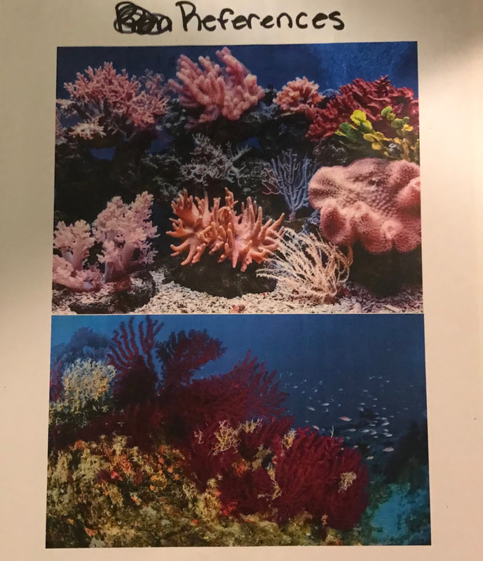
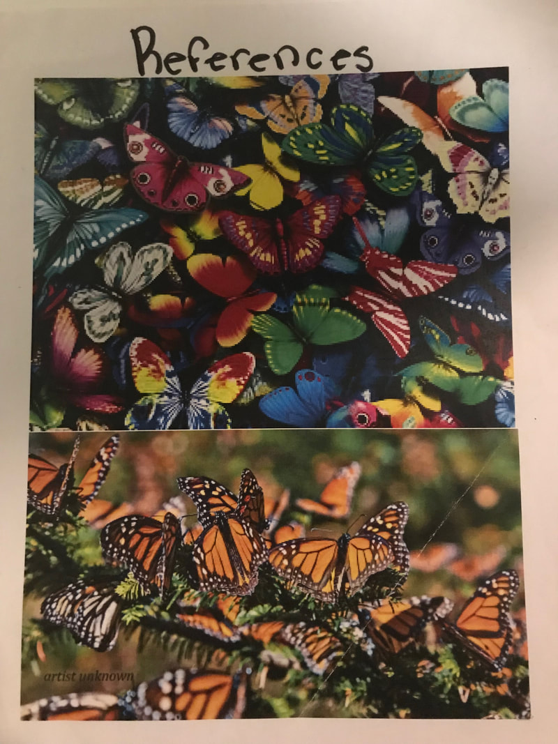
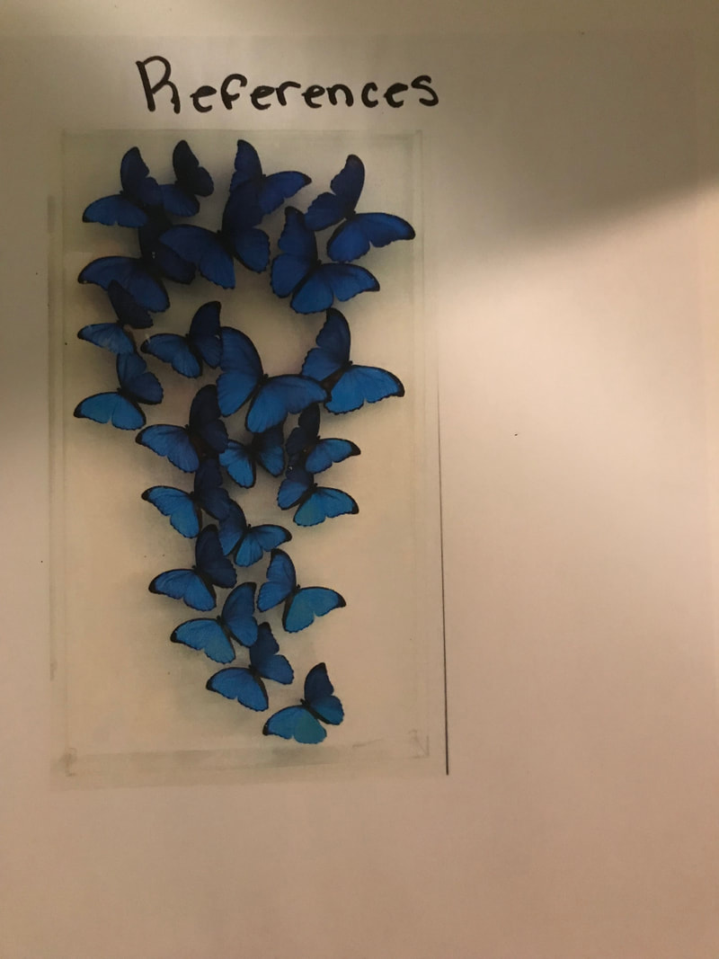
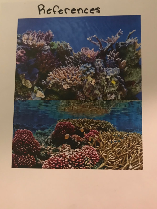
Prisma Color References
|

|
|
|
|
Final Prisma Compositional Sketches
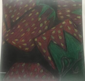
Final Candy Prismacolor
I was assigned to take pictures of candy and then use prismacolored pencils to draw them. I drew the strawberry candies and chose a black background the make the candies pop out.
Final Prismacolor
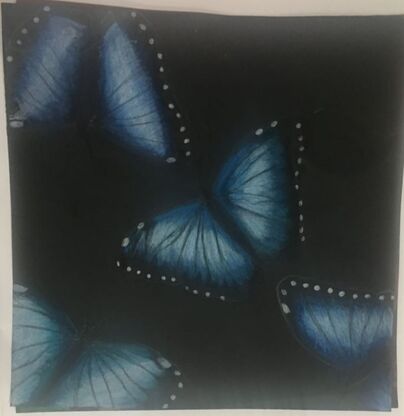
1) I created unity in this piece because I drew one butterfly in different areas on the page. This created repetition and brought the piece together. This also creates movement through the colors shown by drawing your eyes to each corner.
2) I used value to create dimension by adding shadowing on the butterflies. This is important because it helps shape the objects in the overall piece.
3) By using exaggerated colors, I achieved a piece that catches attention and it doesn't look dull.
4) I think that the craftsmanship of the overall project is good because I achieved my goal by making the overall shape of the butterfly look like it is popping out. This image effect creates a visual appeal that draws the eyes to the piece.
5) Yes, I added depth because I chose the black background to make the butterflies pop out on the paper.
6) I loved using the prismas because they blended beautifully and none of the colored pencils were dull. An obstacle that I faced while using them was that I was not able to erase them easily if I made a mistake because they are so vivid.
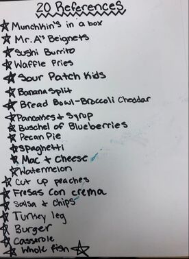
20 Printmaking Ideas
Printmaking Reference Photos
|
|
|
Printmaking in Progress Photos
|
|
|
Final Printmaking
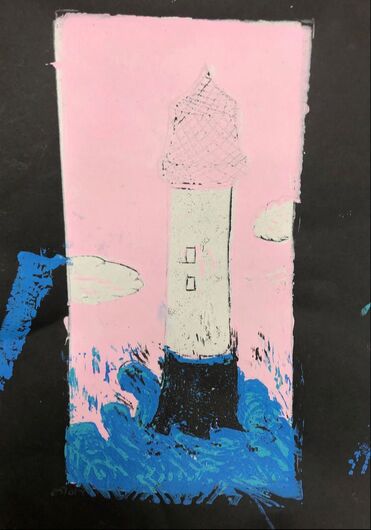
1) I think that I tried my best with the printmaking unit. I don't think it is my best work but I did learn a lot from the process. I realize that printmaking is a lot harder than it looks.
2) I used texture, harmony, and balance by adding many different colors that don't clash together and create a piece that is hard to see but you can tell what I was going for throughout the process.
3) If I could recreate my pieces I wouldn't be as sloppy with the overall paint and I would be more careful with the placement of the paint on the page. Overall, I think that I learned a lot and that is what matters regardless of the fact that this piece isn't my best.
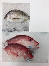
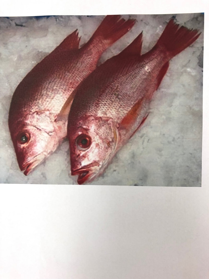
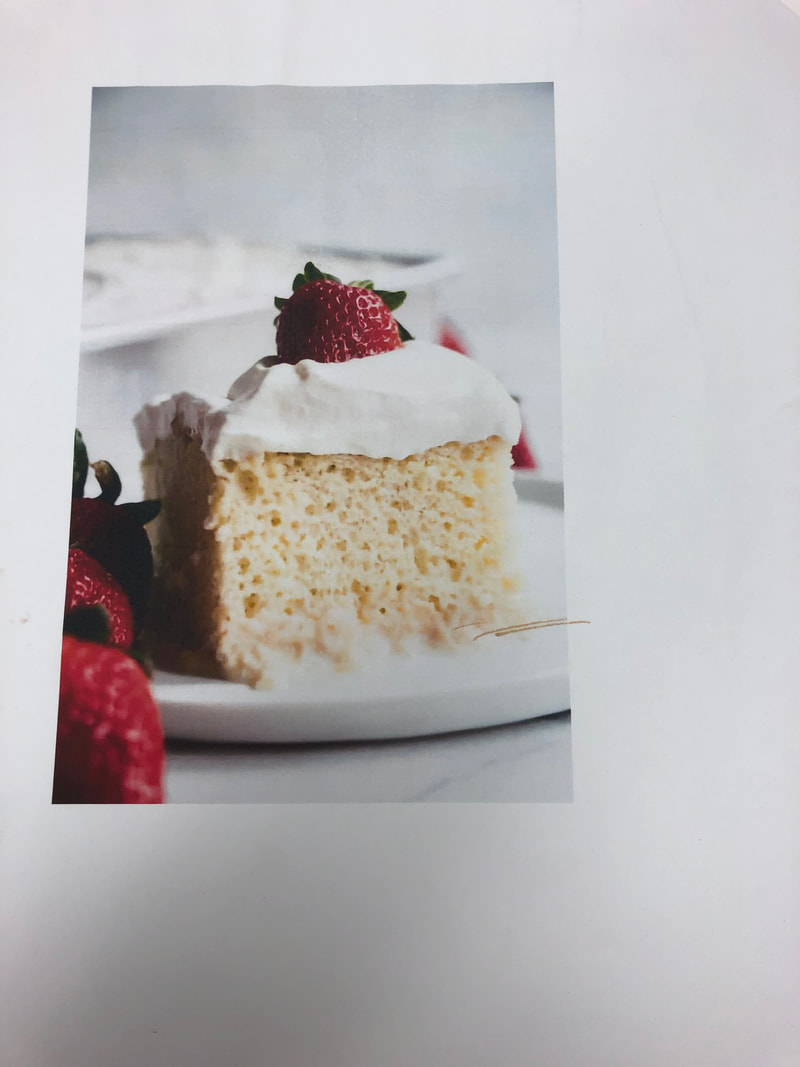
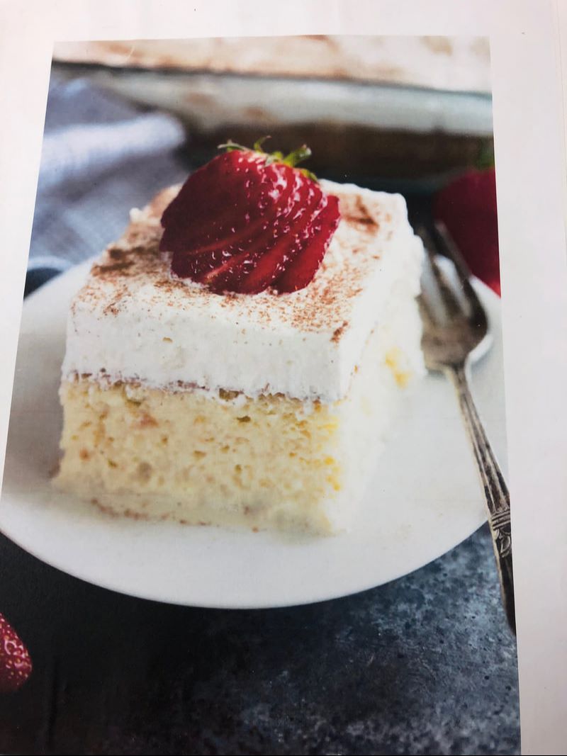
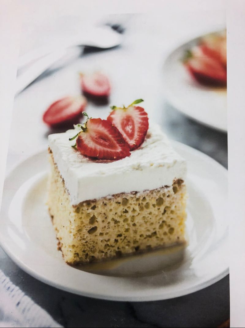
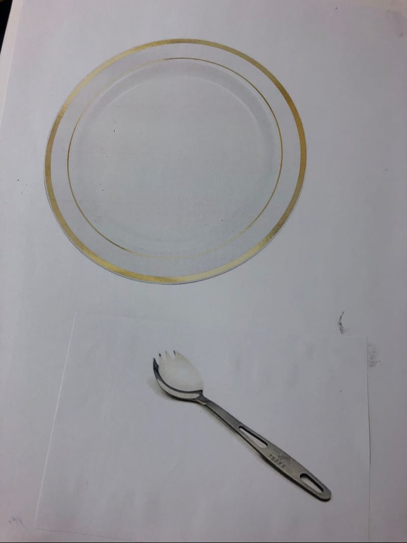
Clay food 20 ideas
Clay food reference photos

|
|
|
|
|
|
Clay food sketches
|
|
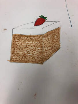
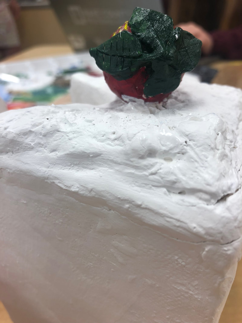
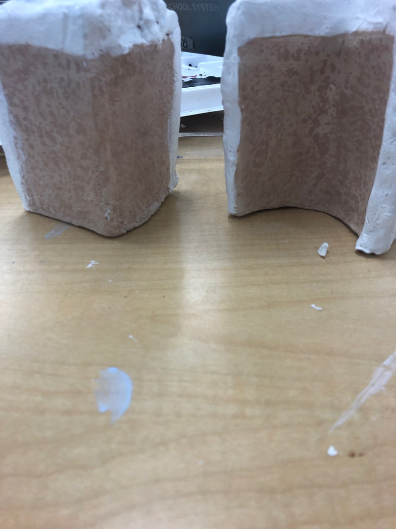
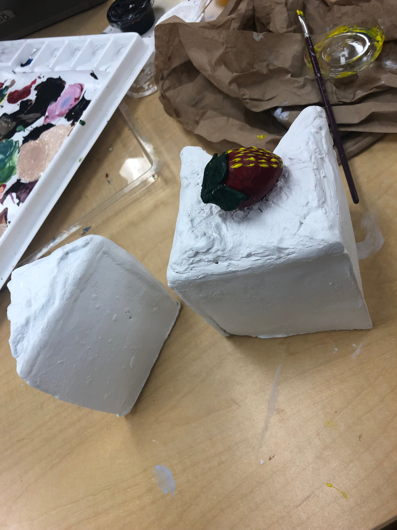
In Progress Clay
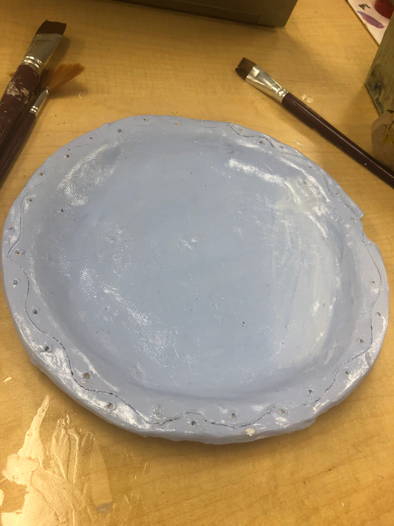
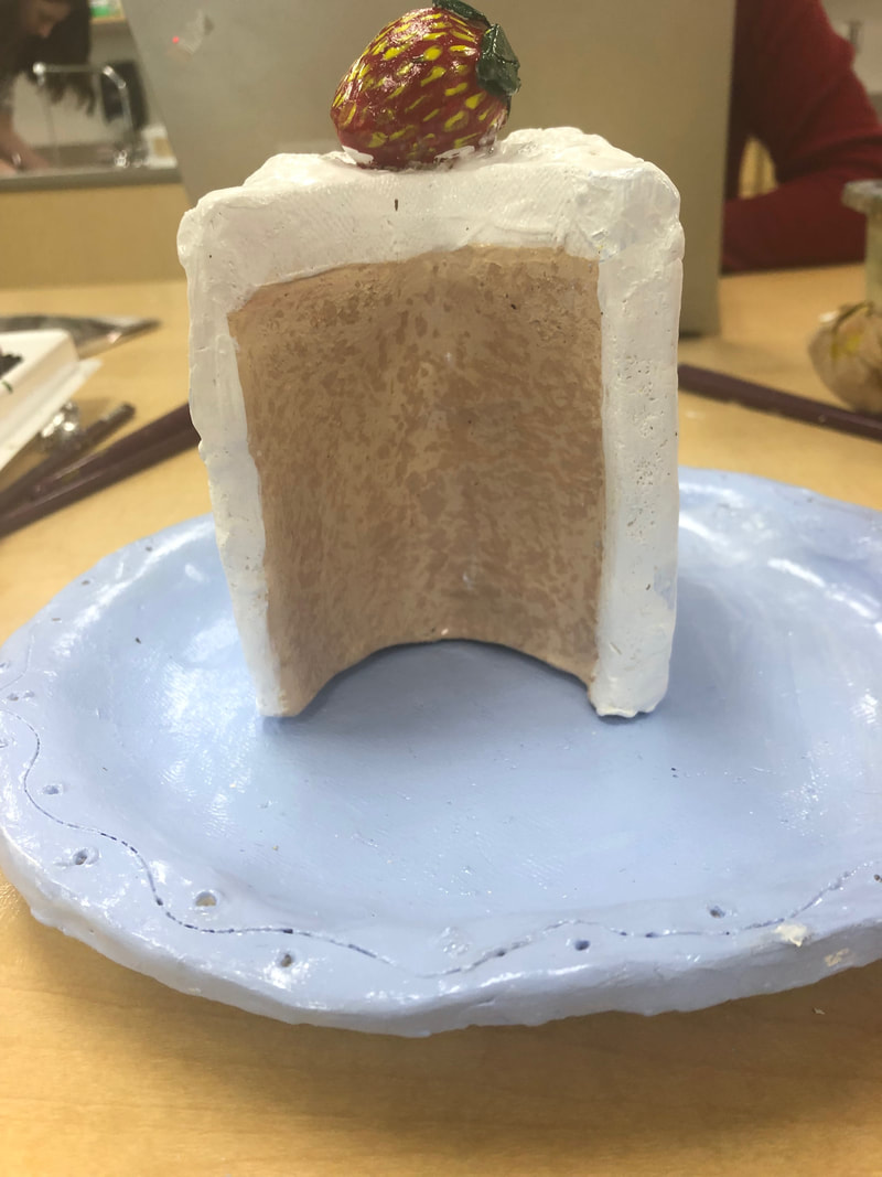
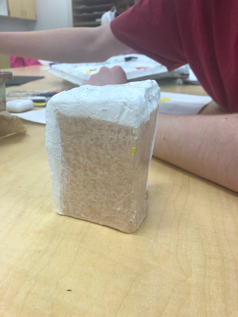
I was assigned to create a food item in the form of clay. I decided to do Tres Leches Cake on a plate.
|
|
|
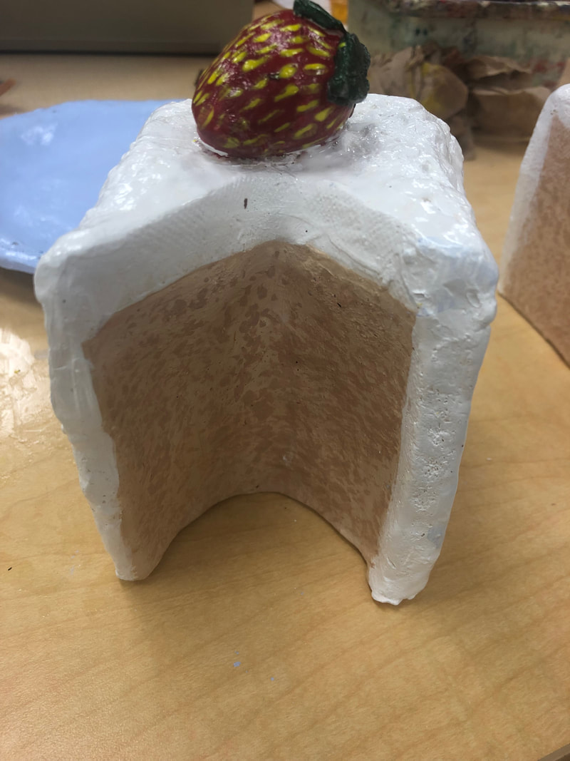
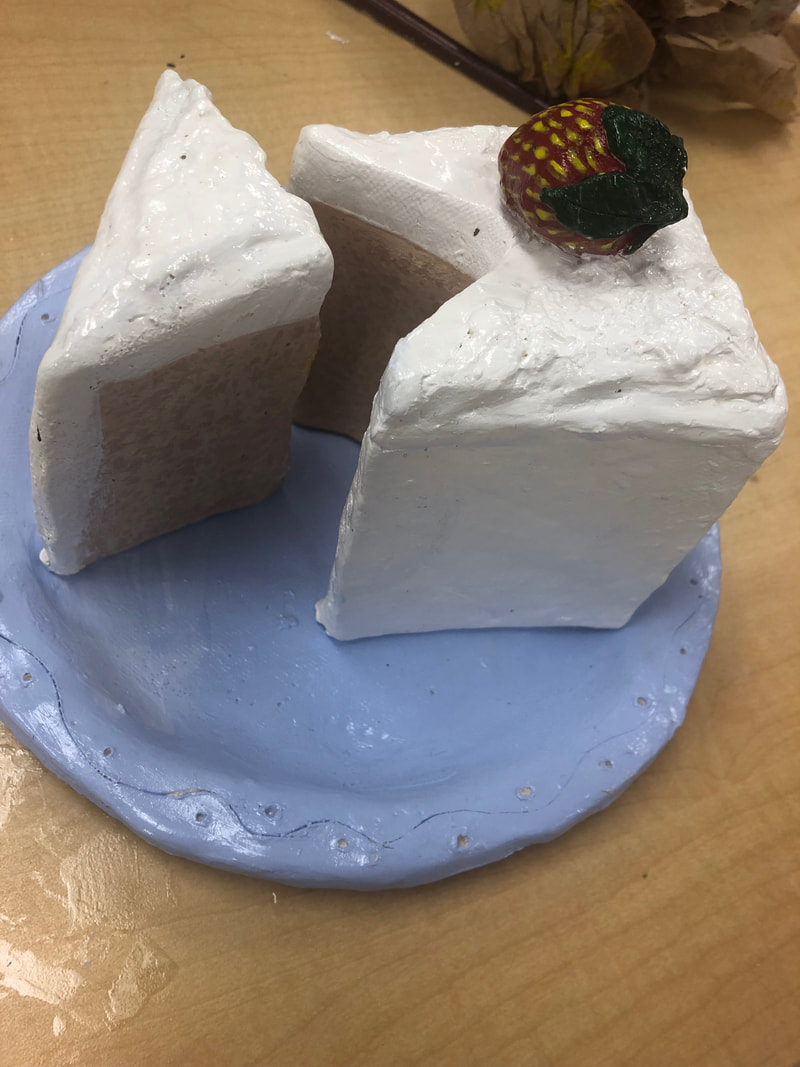
Final Clay Project
1)The craftsmanship of my sculpture is pretty neat and well executed. There is a bit of the plate that broke off and some of the brush strokes on the cake detailing are bold but I think I executed the assignment well.
2)The most difficult part of this project was trying to make the icing look like icing and figuring out a way for it to look good. I think that I accomplished that goal.
3)My color choices are traditional to the cakes original colors so yes, I do think that I successfully chose the right colors. I also think that my subtle purple color for the plate looks really good with my other items.
4)Yes, I think my sculpture is interesting from all views because it has different dimensions and looking at the cake even from the back will show a great view of the strawberry on the top.
5)The differences in making a sculpture and drawing something in 2D is that drawing is easier and isn't as hands on to getting what you want. You have to really work with your hands to get the outcome you want and another difference is that building a sculpture can be more fun because you get to be more creative with what you are making.
6)I created textures by using coffee grains for the cake. I pressed the coffee grains into the clay and would later burn off in the kiln but it gave my clay a nice effect.
7)Yes, because my colors and design of the cake were very traditional just like the edible cake itself.
8)If I were to complete this project again, I wouldn't have used coffee grains because they got moldy and gross after a while and they didn't give me the exact texture that I wanted. I would have used a needle tool and poked holes into the clay itself to give the clay a more defined texture.
|
|
|
|
|
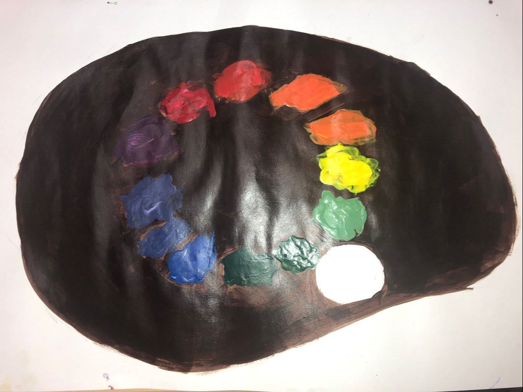
Paint Color Wheel
In class I was assigned to create a color wheel using paint any way I wanted to. I chose to create a palette with the color wheel on the palette.
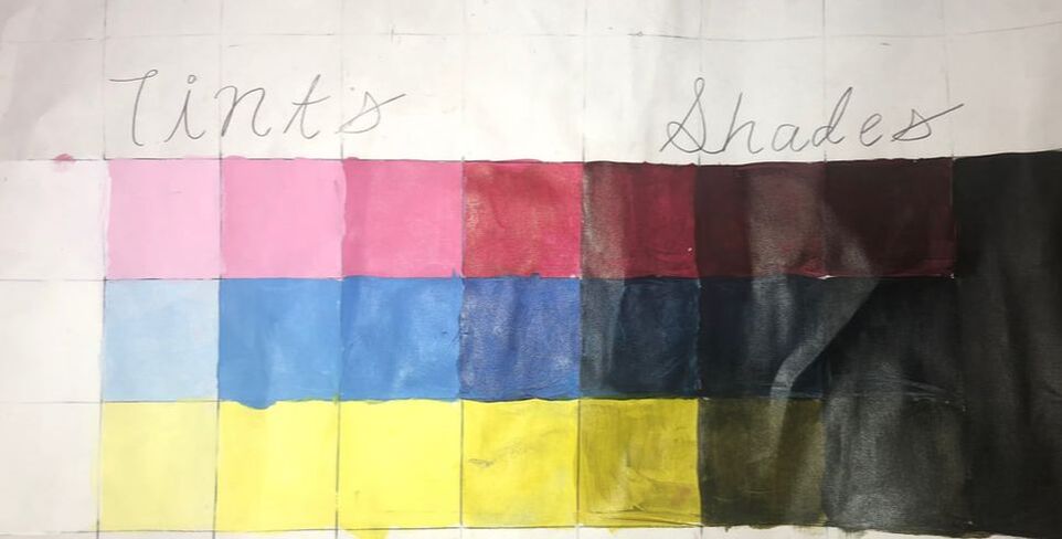
3 Paint Value Charts
In class I was assigned to create a value chart using the primary colors. The value chart of 9 boxes per row and each row had a tints and shades side. The colors would go from light to dark, white to black, with the primary color in the middle.